Stack edit
Graphite, 2023
Stack Edit introduced a visual, streamlined way to manage PR stacks, bridging CLI and web to drive retention. It was my first zero-to-one project at Graphite, which I led end-to-end.
This case study only lists high level decisions and considerations. Let's chat in detail – there's several design choices and technicalities to this project.
Impact
56%
of all net PR submissions
7%
increase in PRs being reviewed on Graphite

Role
Lead product designer and prototyper
Timeframe
3 weeks for design and 6 weeks for implementation and QA.
Also dedicated 6 (non-exclusive) weeks to the redesign.
Target user
Graphite users primarily using the CLI
Our primary goal was to transition all CLI users, particularly those not yet reviewing code on Graphite, to our web tool. The number of such users was notably high, and many we spoke with were unaware that a web tool even existed.
Business goal – boost web tool usage to improve retention
Our goal was to boost active reviewing on Graphite, since its pricing model counted users who created, reviewed, or merged PRs. Retention was key, as data showed users who engaged in multiple actions stayed longer. This feature also laid the foundation for AI-generated PR titles and descriptions, later implemented.
Hypothesis
Introducing the web app to users will help them become more familiar with it, ultimately increasing their engagement with our web interface.
User value – visualise PR stack and take bulk actions
The business goal was clear, but this wasn’t a feature users had asked for. They were content creating PRs through the CLI. My challenge was to identify the value for users and determine what functionality would make them want to use this feature.
Insights
From user interviews and dev-relations, key needs emerged:
Bulk actions (add reviewers, labels, merge-when-ready)
Add titles/descriptions
Seamless stack navigation
Kickstarting design – layout explorations first


Key functionality


Users preferred skipping the PR inbox and jumping straight to the last PR in their stack for self-review. This insight led me to revise the modal’s core CTA.

Key decisions
Draft mode: Treated all PRs as drafts so users could add details before publishing and avoid early reviewer notifications. Technical limits prevented this for personal accounts/feature flags.
Keyboard accessibility Made the flow fully keyboard-driven for CLI users, with commit messages pre-filling titles and focus jumping to description.
GH templates in descriptions: Planned to pre-fill GitHub templates, but dropped due to scope.
PR page link: Added link from PR page to Stack Edit for consistent access.


User testing
Users saw no value in duplicating descriptions across the stack.
Without a dedicated stack description, the approach lacked clarity and intuitiveness.
Animation clarified stack direction, balancing upward visuals with “downstack” terminology.
Users preferred publishing or drafting PRs individually rather than all at once.

Prototypes and stack direction

AI generate title + description
Graphite’s vision is to speed up development. Automating titles and descriptions fits this, with Stack Edit – an author-focused surface – being the ideal place, alongside the reviewer-focused PR page.


Reduce negative space to improve description readability

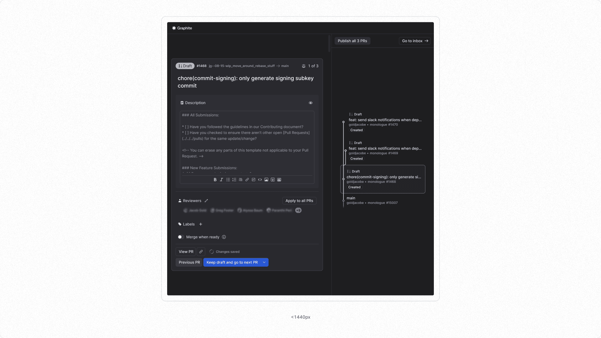

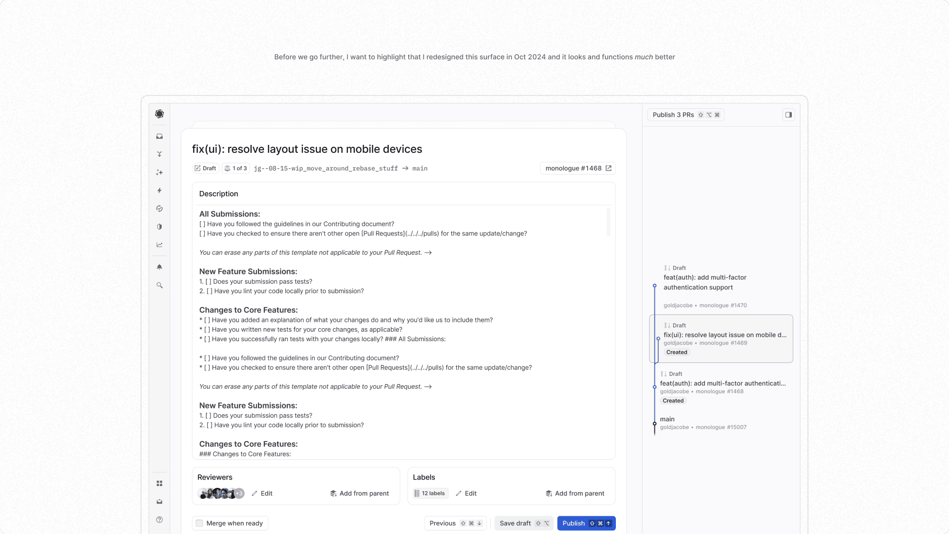
Redesign
A year later, I redesigned this surface to accommodate user feedback and improve its UI to match our own internal quality bar. A few screenshots below:


